
【獎項 Prizes】 專業應用精進獎 Advance Application Award
【國家或地區 Country/Region】 Taiwan臺灣
【公司/團隊 Company/Group】 日目視覺藝術有限公司247Visual Art
【設計師姓名 Designer】 陳普、黃顯勛
【作品介紹 Description】
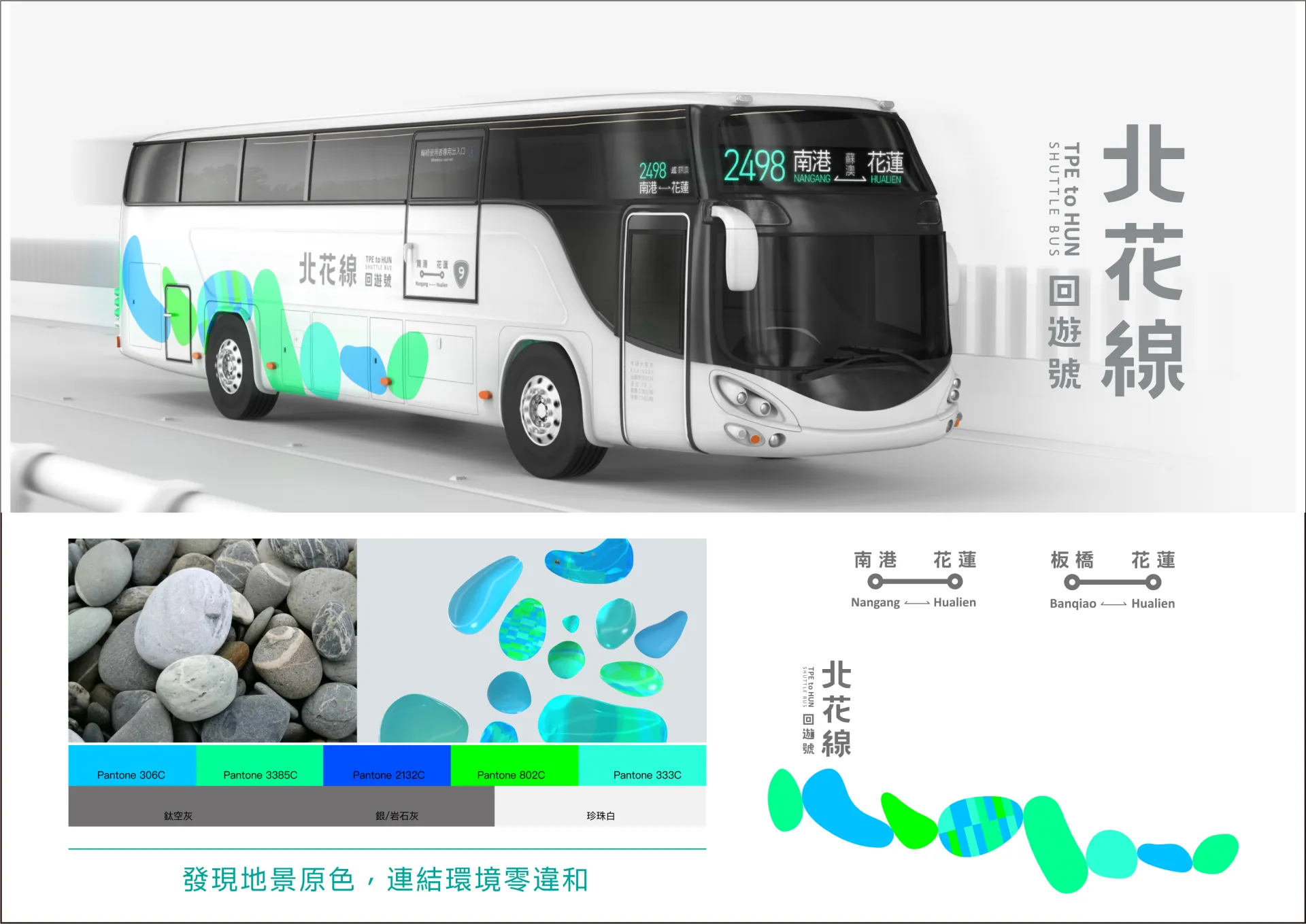
「北花線-回遊號」公運美學品牌計畫由經濟部與交通部跨部合作,在台灣設計研究院帶領日目視覺藝術、大衍國際2家專業設計團隊,聯手將設計導入公路運輸服務,並配合2020年1月6日蘇花改開放全線通車,由公路總局授權首都、臺北與統聯3家客運業者行駛「台北-花蓮」全新路線。
-
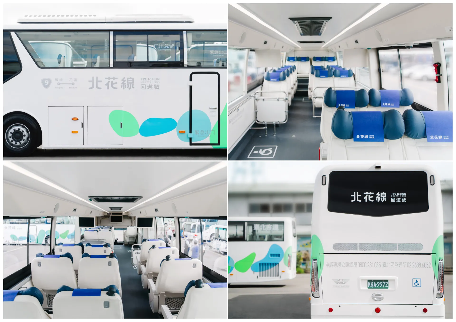
此計畫發現花蓮在地元素,以自然水色與鵝卵石為品牌視覺,透過8顆相連的石頭象徵蘇花改全線貫通的8個隧道,打造全新形象;並以鵝卵石概念改造具人體工學的寬敞座椅與可調式造型頭枕,提升長途車程的舒適度;內裝透過色彩、材質整合,減少異材質使用、淡化材質紋理、簡化線條大原則進行「減法設計」,車體更大膽以白、藍色系呼應。
-
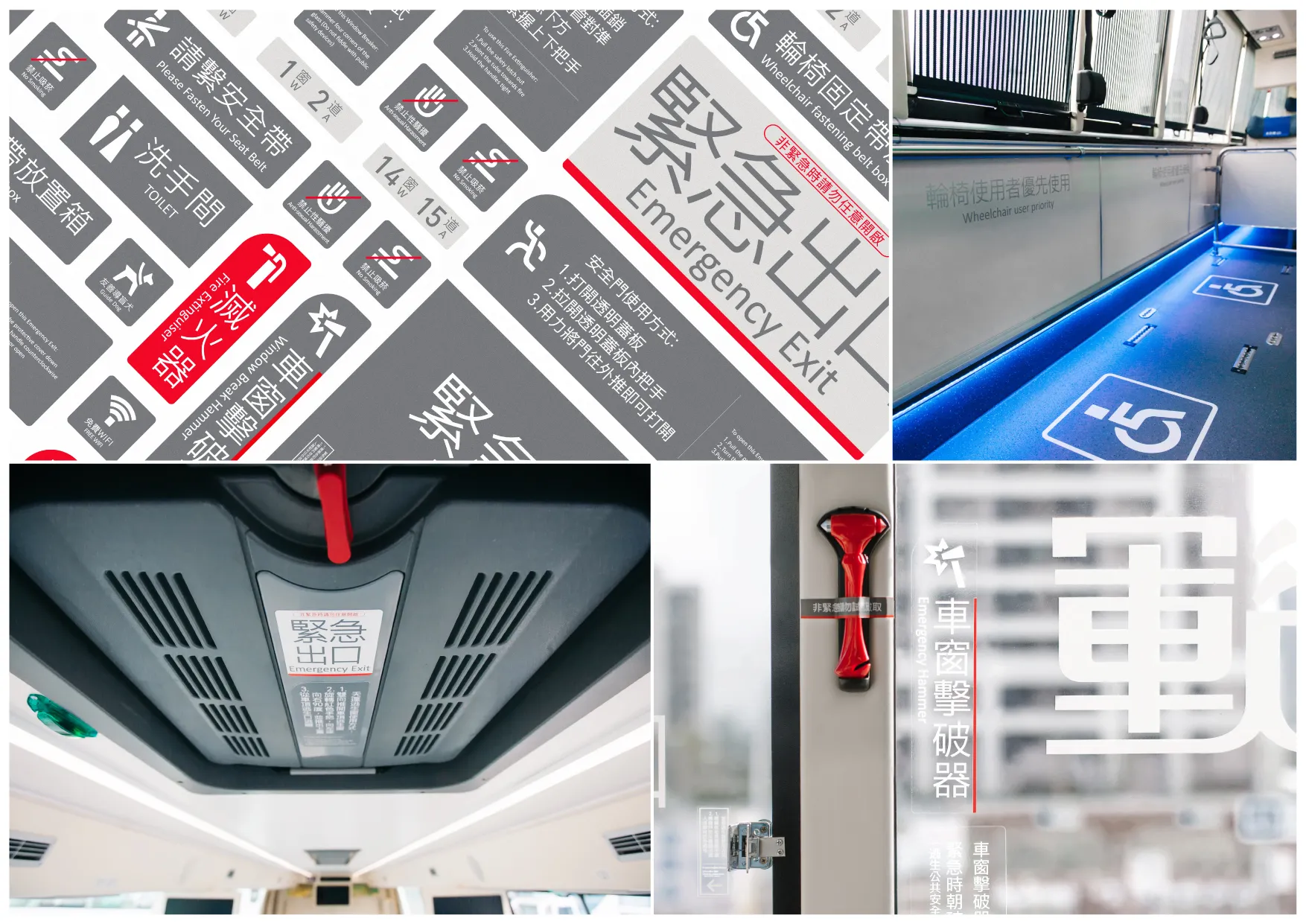
資訊指標也在法規原則下重新盤點,透過視覺計畫檢視必要性;全方面從品牌路線、車體外觀、內裝優化等項目逐一著手,引領公路運輸產業的整合共創,優化大眾搭乘公運的服務體驗,徹底顛覆過去公運巴士的刻板印象,打造最美的移動風景,宣告台灣「公運美學」誕生!
-
具體效益上,創造台北花蓮雙城高度關注與支持,吸引國內外超過50家媒體採訪報導與近100篇電視、網路及紙媒露出;每日營運最高服務5,000人次,並獲得9成以上乘客表示滿意,成功運用口碑行銷,促進觀光效益。
MOEA and MOTC introduce design to public transportation. New routes (TPE-HUN Public Transportation) via Suhua Highway were launched by three service providers on January 6, 2020. - TDRI led the two professional design teams for the execution, targeting branding, bus exterior design, information design, and interior optimization. Through subtraction strategy, co-creation is facilitated to improve public transit experience. - Achievement of design realization:Local Elements|Pebbles of Hualien’s famous Chih Sing Lake are used for the main visual. 8 pebbles symbolize the eight tunnels along the way. Green (mountain) and blue (sea) are used to create a new image. . Subtraction Design| Avoiding heterogenous materials, lightening textures, and simplifying lines; white and blue interior presents a consistent look and pressure-free space, allowing people to enjoy the beautiful sceneries outside. . Human Factors| Ergonomic chairs and pebble-shaped adjustable headrest enhance comfort. Highlight of the project is the design of the headrest. . Information Redesigned| Reexamining regulations and utilizing subtraction design to redesign signage system. Colors are used for different levels of urgency. Bilingual signs create friendly experience. _ Track records & features:With public interest and support, the project attracted over 50 domestic and overseas media, achieving 100 TV, online, and print media exposures.Highest daily ridership reached 5,000; over 60% of passengers learned about the services via social media, followed by friends and families. Over 90% expressed satisfaction. Successful WOM marketing generates tourism benefits.


