
【 Prizes|獎項 】 Distinction|優選
【 Country/Region|國家或地區 】 Macau|澳門
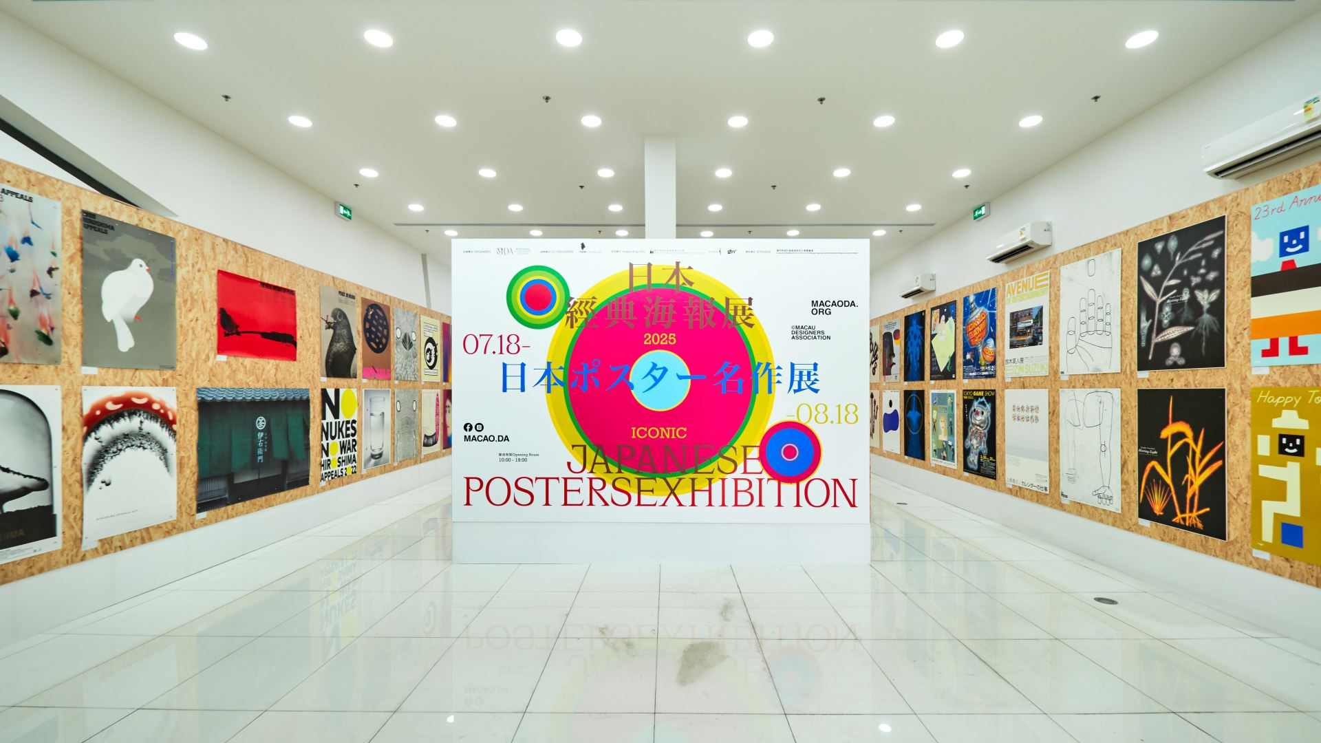
【 Design Team|設計團隊 】 UNTITLED MACAO/UNTITLED DESIGN,LTD|未設計有限公司
【 Designer|設計師 】 Au Chon Hin|歐俊軒
【 Description|作品介紹 】
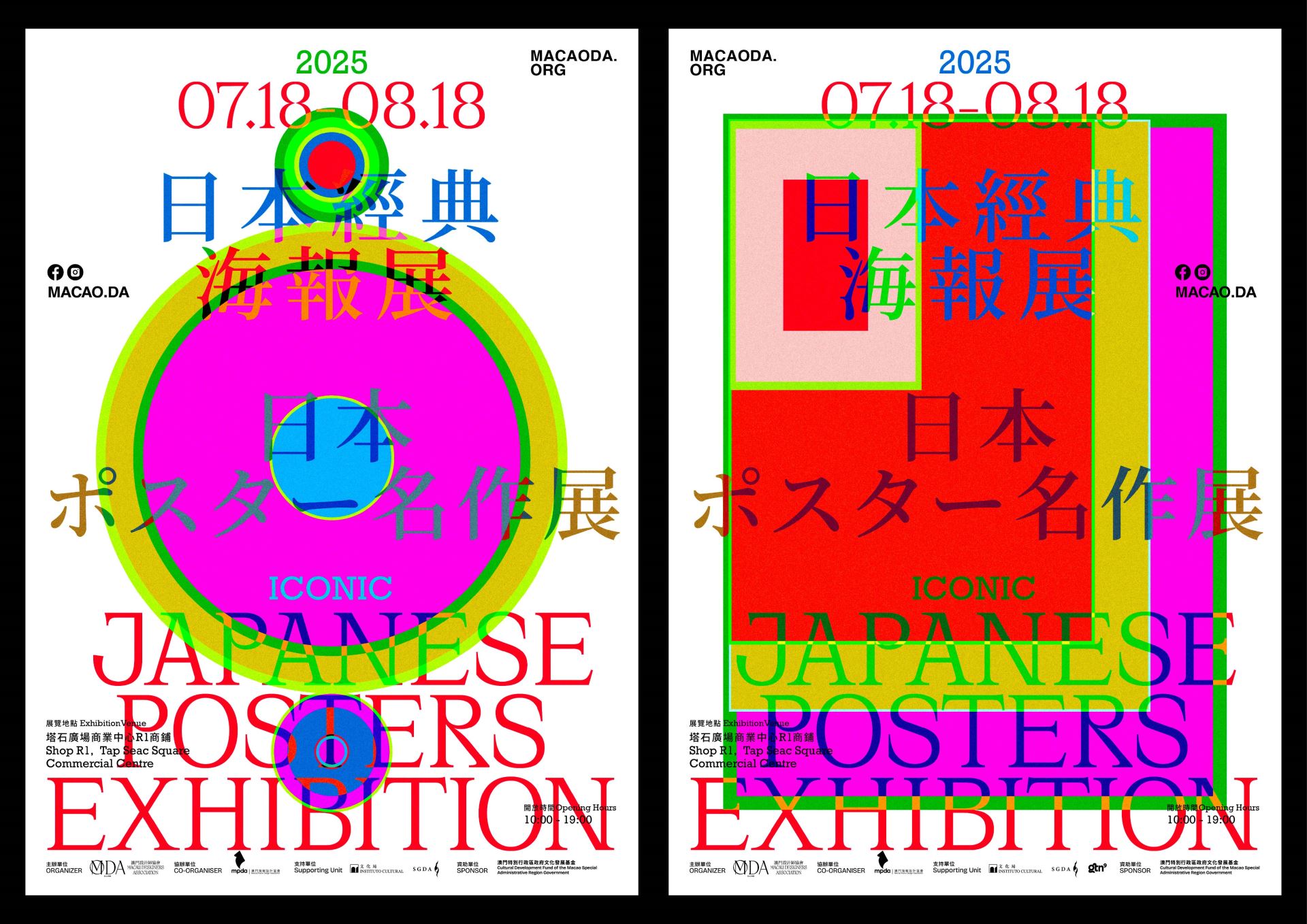
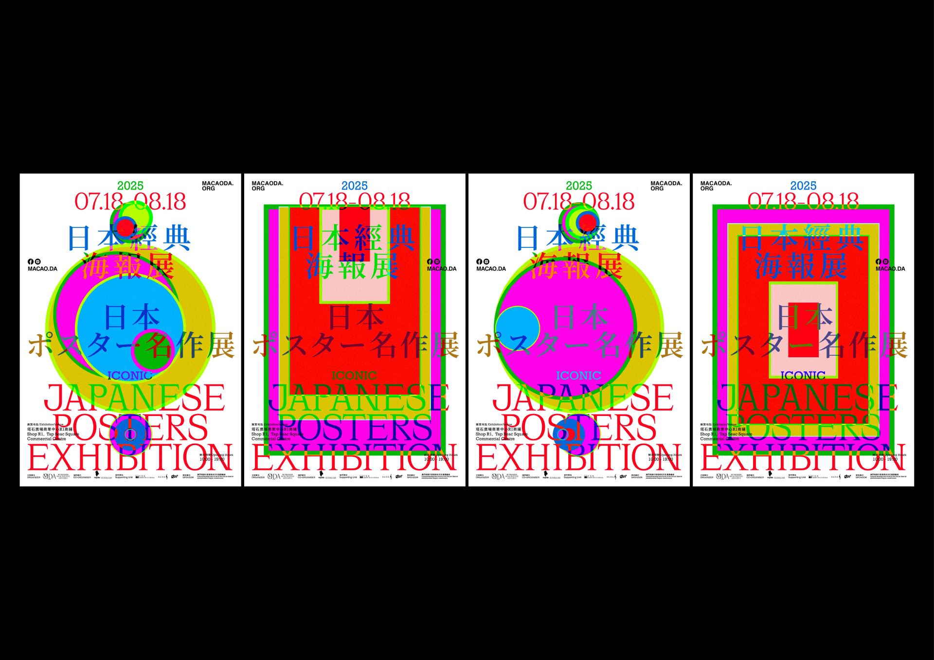
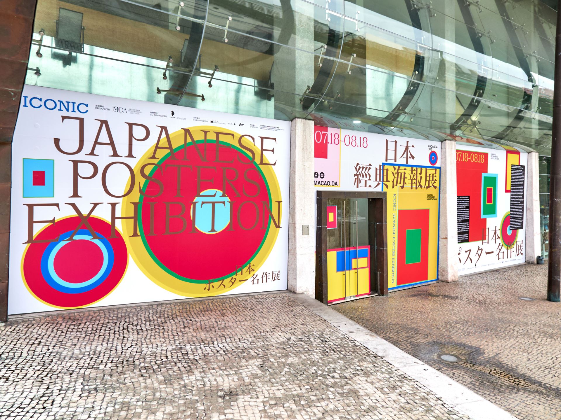
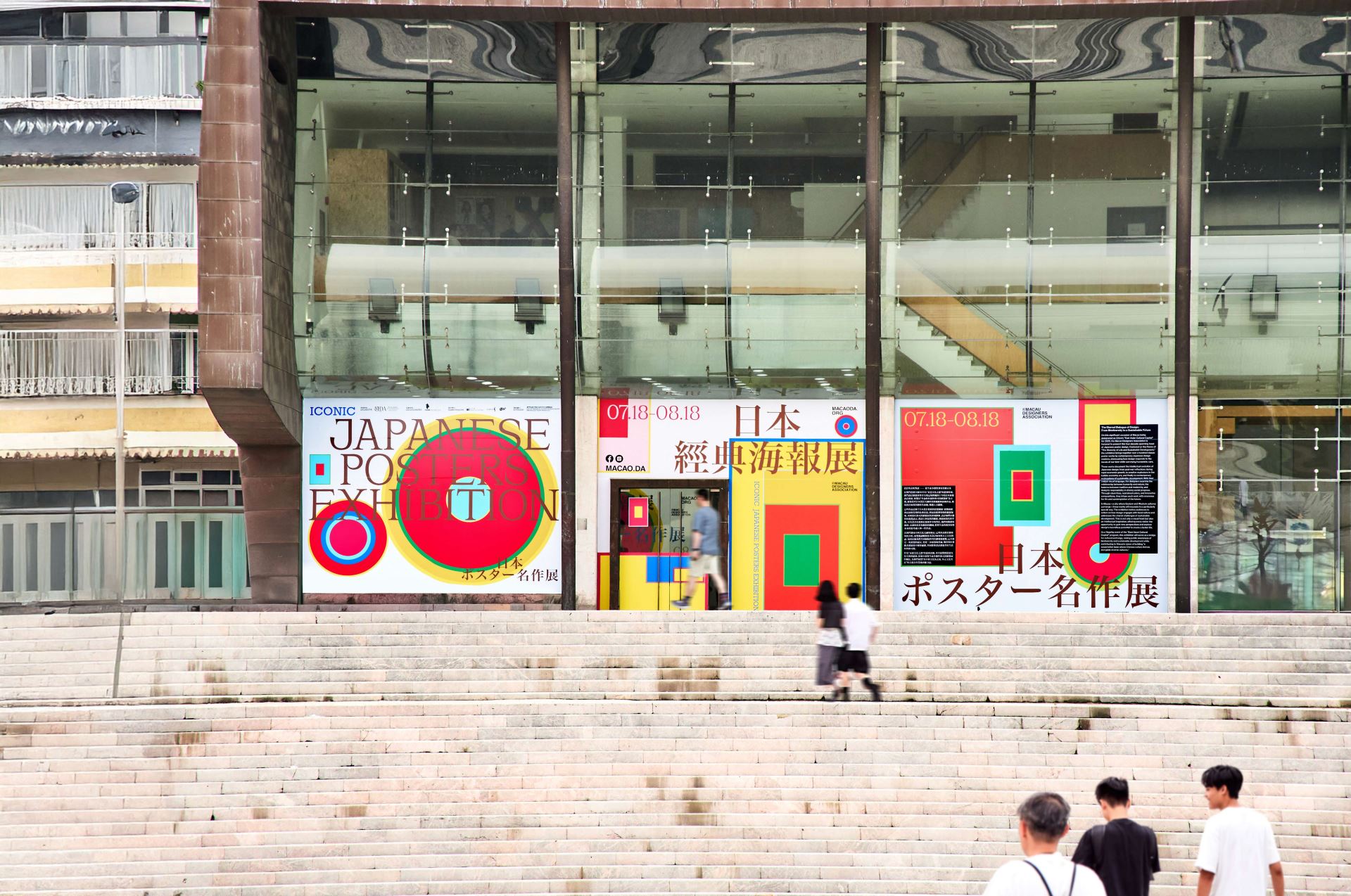
The Japanese Classic Poster Exhibition posters reimagine the physicality of stacked and rolled posters through a top-down perspective, translating their forms into dynamic visual language. This approach mirrors the exhibition’s core theme—The Diversity of Life and Sustainable Development—by symbolizing how Japanese design, across generations, responds to societal shifts while retaining humanistic depth.
Rather than reducing the exhibition to a single stylistic homage, we employed color blocks as a conceptual framework: they appear as "unloaded folders," their deceptively simple surfaces hinting at layered design legacies. Each hue embodies a distinct era or vision—post-war introspection, bubble-era exuberance, or contemporary sustainability—yet harmonizes within the composition. Like the roots of Japanese design culture, these blocks intertwine without obscuring one another, much like the roots of Japanese design culture—deeply grounded in tradition yet continually sprouting new possibilities, embedding reverence for life and reflections on the future into the work.
---
日本經典海報展系列海報以俯視視角為靈感,捕捉海報疊放或捲起時的獨特形態,將靜態的物理狀態轉化為視覺語言。此構思與展覽主題「生命的多樣性與永續發展」相呼應-正如展覽匯集了多位日本設計大師的作品,跨越不同年代與文化背景,每張海報都承載著獨特的色彩、元素與敘事,共同展現設計如何回應時代命題,傳遞人文關懷。
正因如此,我們難以直接用某位大師的風格來概括整個展覽,於是選擇以「色塊」作為隱喻:它們如同尚未加載完畢的文件夾,表面是簡潔的幾何與色彩,內裡卻隱藏著層層疊疊的設計脈絡。每一塊顏色都代表一個時代、一位設計師,或一種美學主張——從戰後經濟高速增長的社會反思,到泡沫經濟時期的創意爆發,再到當代對永續發展的深刻探索。這些色塊相互交疊卻不彼此覆蓋,就像日本設計文化的根系,既深植於傳統,又不斷生長出新的可能,將對生命的敬畏和未來的思考融入作品。


