
【 Prizes|獎項 】 Distinction|優選
【 Country/Region|國家或地區 】 China|中國大陸
【 Design Team|設計團隊 】 IMAGRAM Design|言文設計
【 Designer|設計師 】 Peitao Chen|陳沛濤, Yichang Yan|嚴怡暢, Yan Liu|劉燕, MeiMei Yang|楊媚媚
【 Description|作品介紹 】
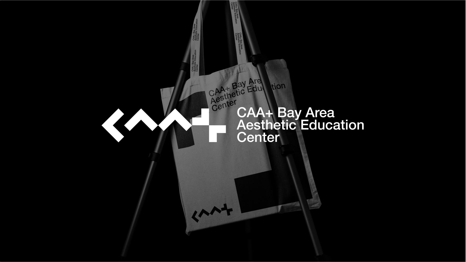
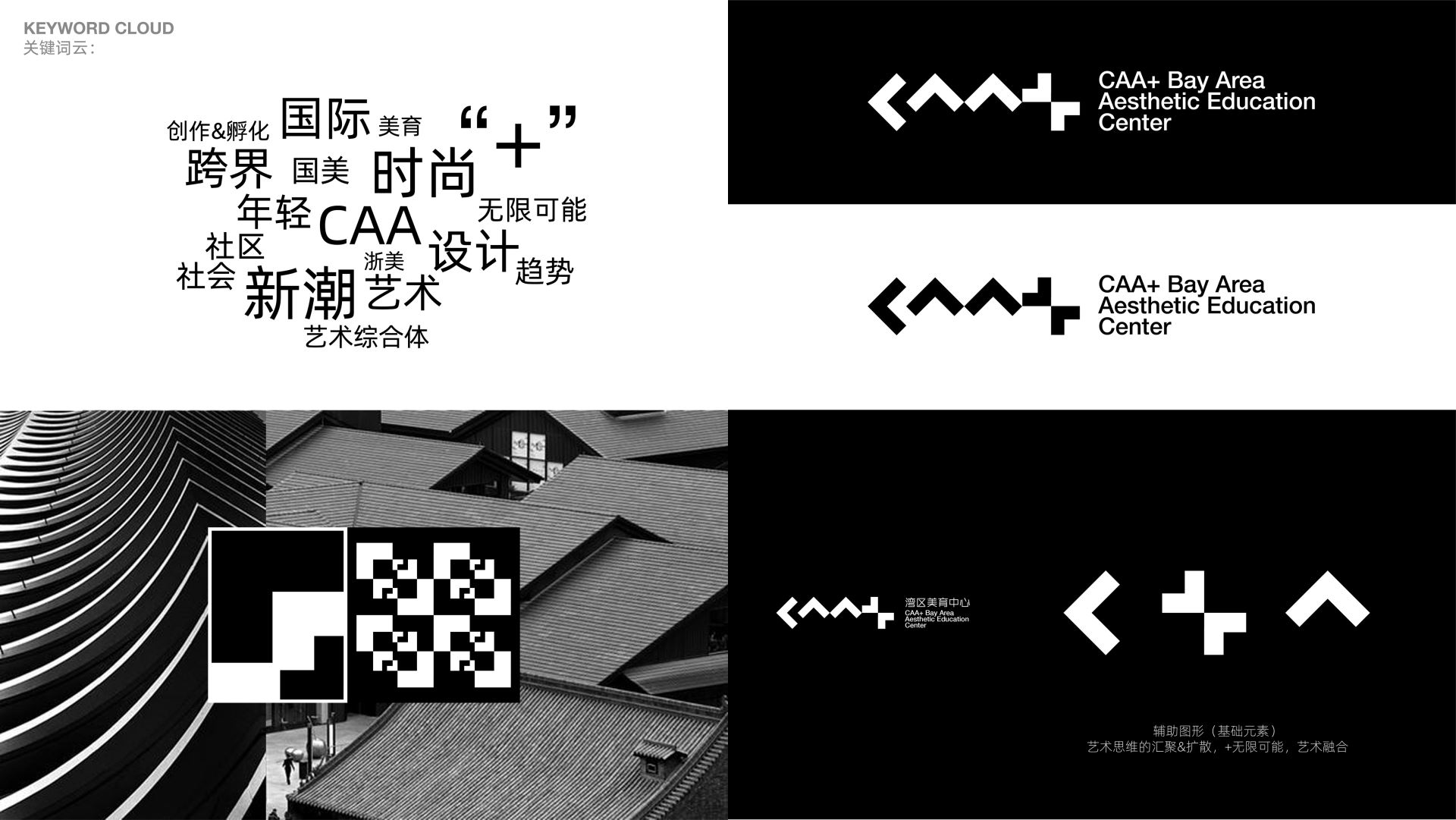
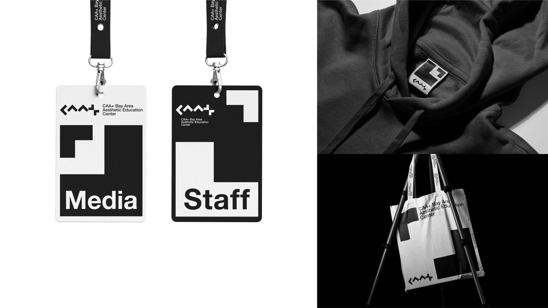
CAA+ Bay Area Aesthetic Education Center uses minimalist and abstract language for unified visual transformation. The forward and upward arrows represent the professional and profound academic resources and background of the Aesthetic Education Center to promote aesthetic education.
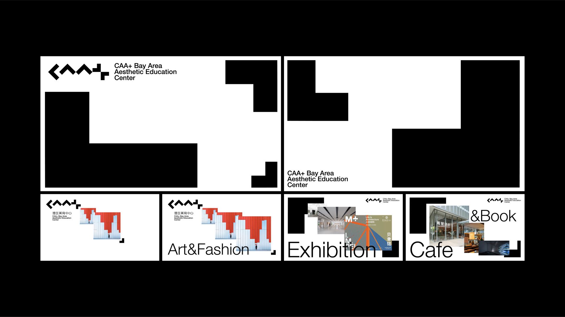
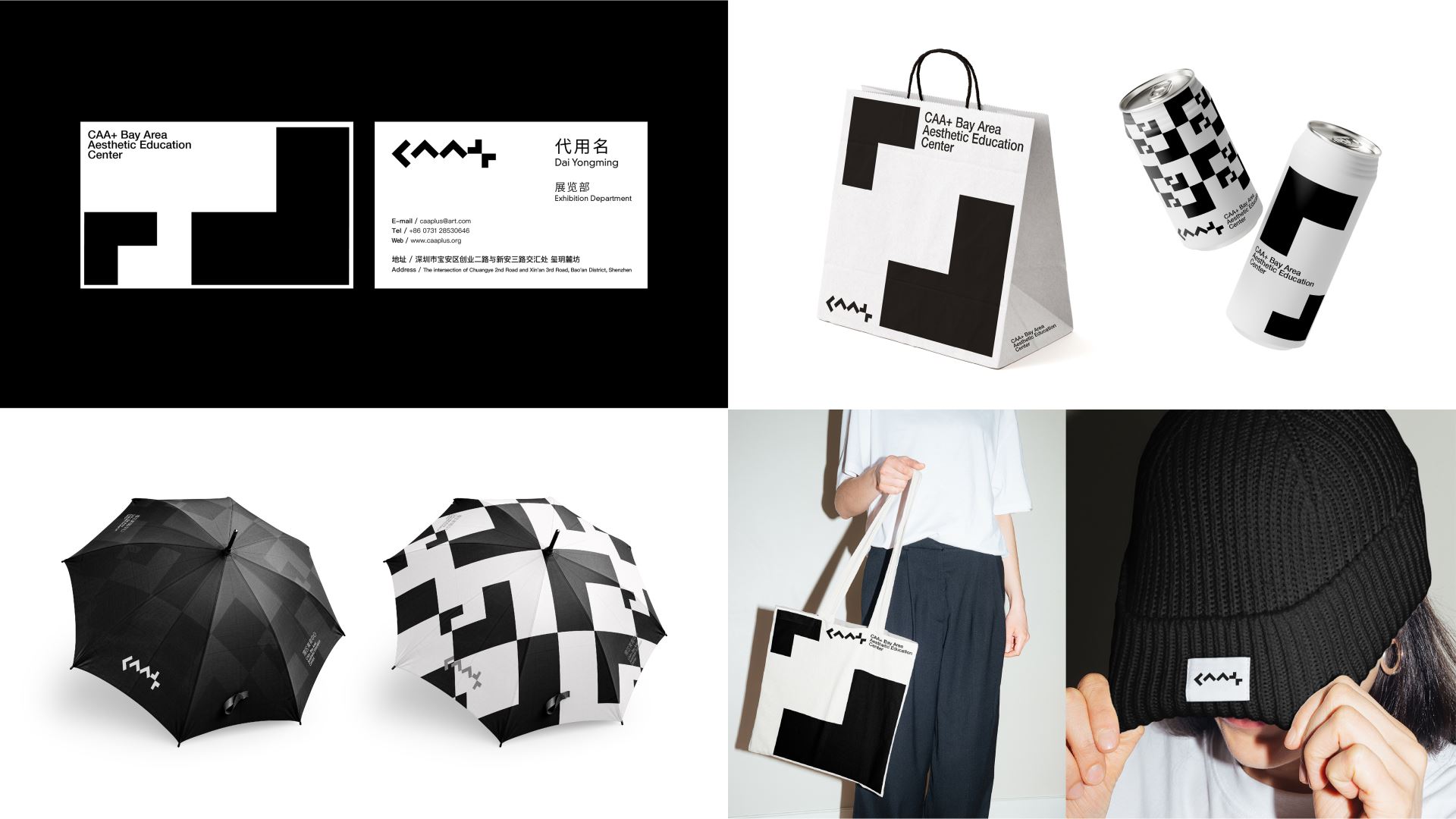
The double arrows converge to form a "+", which is the mutual cooperation between China Academy of Art and the Bay Area. It is also a spiritual highland where academic (philosophy) and art (beauty) converge, and it is also the successive influx of various artistic resources and talents. "+" represents infinite possibilities. After the "+" double arrows converge, they spread outward and are flexibly applied to different media sizes and brand materials, which is highly brand scalable and recognizable. At the same time, it is the embodiment of the value of aesthetic education communication, and it is also the implicit expression of the "wall-less college". Philosophy and thinking converge here, and beauty and education are spread here, from point to surface, radiating to the community, city, and society.
---
CAA+ 灣區美育中心的標誌,以極簡抽象的語言來突出強化“CAA+”,C、A、A均以向前、向上箭頭的抽象符號來構成,有效進行統一的視覺轉化。向前、向上箭頭代表著美育中心的以專業、深厚的學術資源與背景來推進美育事業。雙A向上箭頭也如一棟棟建築體,傳遞社區美育的起點。
雙箭頭匯聚巧妙構成“+”,是中國美術學院與灣區的相互攜手,也是學術(哲)與藝術(美)共同匯聚的精神高地,更是多方藝術資源、人才的相繼匯入。 「+」更代表無限可能,「+」雙箭頭匯聚後又向外擴散,並靈活應用於不同媒材尺寸與品牌物料,極具品牌延展性與辨識性。同時是美育傳播的價值體現,更是「無牆學院」的隱性表達,哲與思匯聚於此,美與育又在此傳播,由點及面,輻射社區、城市、社會。


