

【 Prizes|獎項 】 Distinction|優選
【 Country/Region|國家或地區 】 Japan|日本
【 Design Team|設計團隊 】 tomuradesign inc.
【 Designer|設計師 】 Sho Tomura
【 Description|作品介紹 】
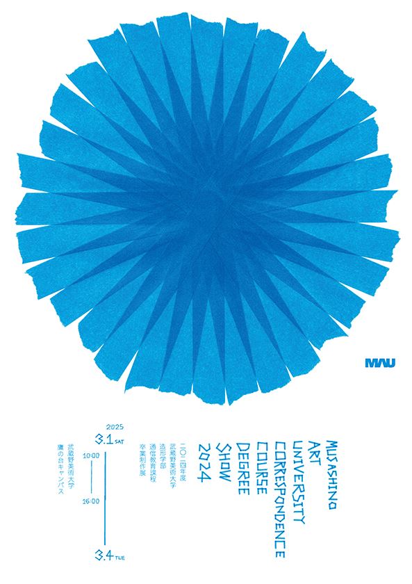
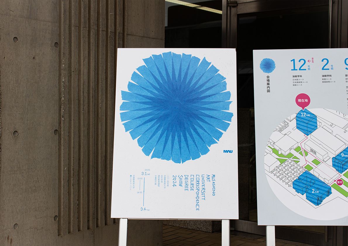
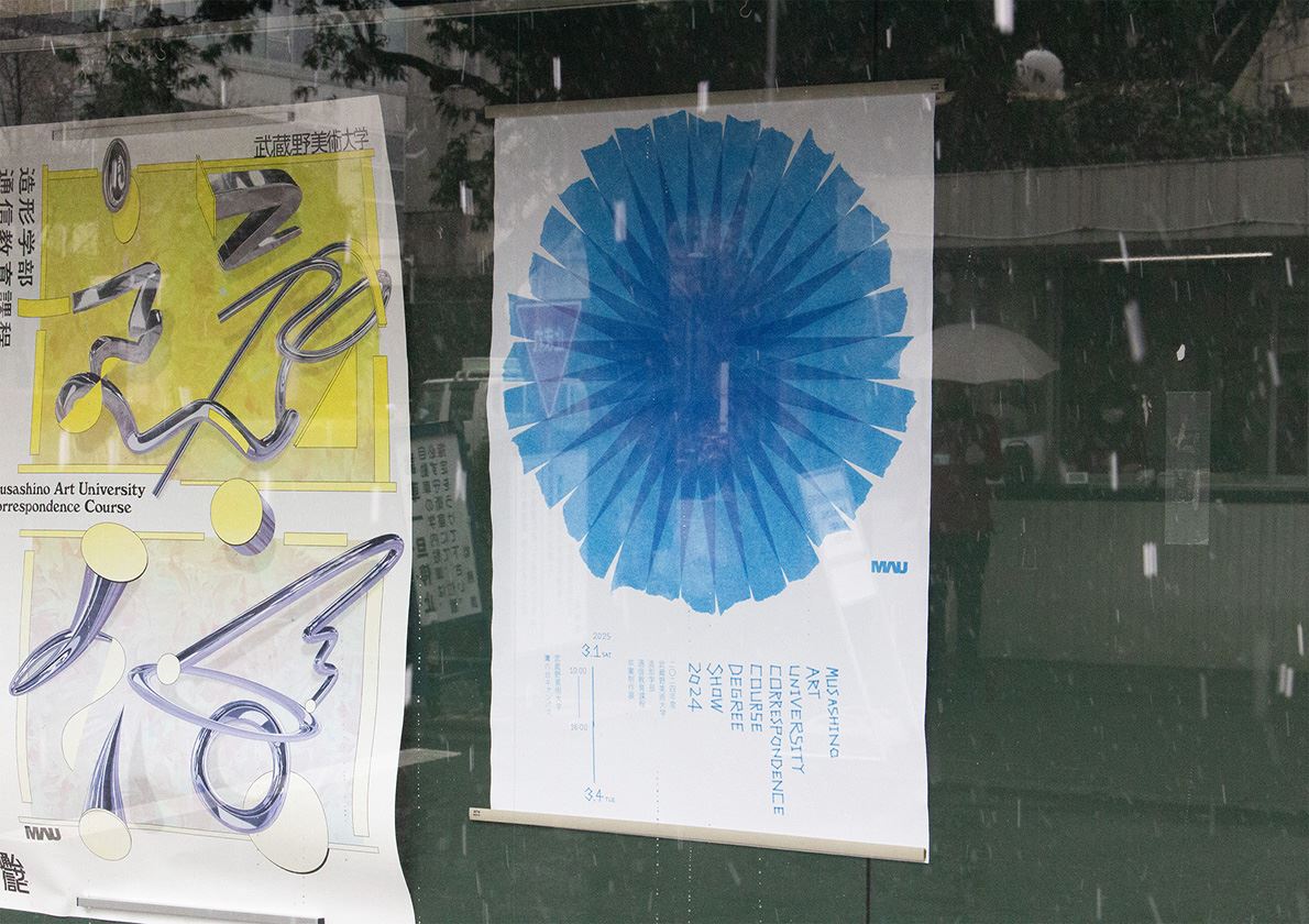
A correspondence course graduation exhibition held at Musashino Art University in March 2025.
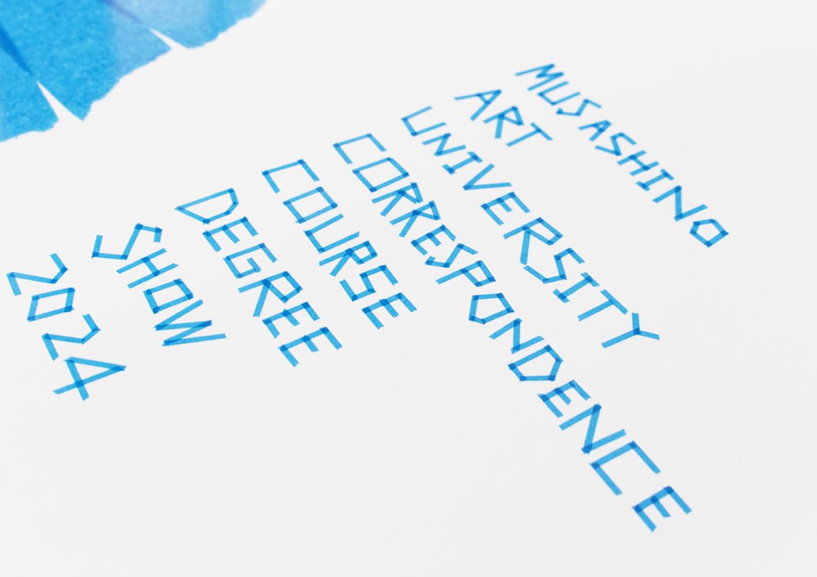
As the designer himself was a graduate of Musashino Art University's correspondence course, he worked to create visuals based on his actual experiences while in school. Focusing on the uniqueness of the correspondence course, where students repeatedly submit assignments by mail, we decided to create visuals using packing tape as a motif. After a deep exploration of visual expression with tape, we were able to draw the conclusion that a large flower would be the main visual element. All European typefaces were also expressed on tape. The Japanese typefaces were also written in pencil, and the result is a one-of-a-kind visual created with a focus on the power of analog expression.
This year's Graduation Works Exhibition attracted the largest number of visitors ever. The poster visual may have helped to achieve this.
這是為東京武藏野美術大學函授課程2024年畢業展設計的海報。
設計旨在革新過去的視覺形象,激發更廣泛觀眾對展覽的興趣,提升參展藝術家的創作動力,並在展覽空間內營造出團結統一的氛圍。
由於設計師本身是武藏野美術大學函授課程的校友,視覺創作的靈感來自於她在函授學習期間的個人經驗。考慮到函授教育的一大特色⸺需要反覆郵寄作業⸺設計師決定以包裝膠帶作為視覺元素。經過對膠帶視覺表現力的深入探索,最後確定在畫面中心放置一朵大花。這朵花的圖案經過多次修改,最後由16條膠帶組成。
此外,所有拉丁字母字體也均採用膠帶繪製而成。每個字母都經過反覆推敲和精心製作。日文字體也採用了鉛筆手繪的風格,強調了模擬表現形式在塑造整體海報視覺效果方面的力量。
最終呈現的視覺效果獨樹一幟,完全出自設計師的筆觸和感悟,未依賴任何數位技術。
在藝術大學廣闊而略顯冷清的空間裡,這張僅以美麗的藍色為主色調的海報散發出強烈的存在感,為展覽場地增添了一抹亮色,給參觀者留下了深刻的印象。
大學官方社群媒體平臺上的反應異常正面。此外,參展藝術家也紛紛留言,例如「我畢業那年正好用了這個視覺設計,真是太幸運了!」。我們相信,這無疑地實現了我們營造展覽空間統一感的目標。
本次畢業展的參觀人數也創下了歷史新高。這張海報或許是其成功的重要因素之一。


