【 Prizes|獎項 】 Distinction|優選
【 Country/Region|國家或地區 】 China|中國大陸
【 Design Team|設計團隊 】 Z WAVE DESIGN|后浪设计
【 Designer|設計師 】 Zhongbiao Jiang|蔣忠彪, Yinan Lyu|吕憶南, Yuqi Pang|龐育其, Irene Li|李艾霖
【 Description|作品介紹 】
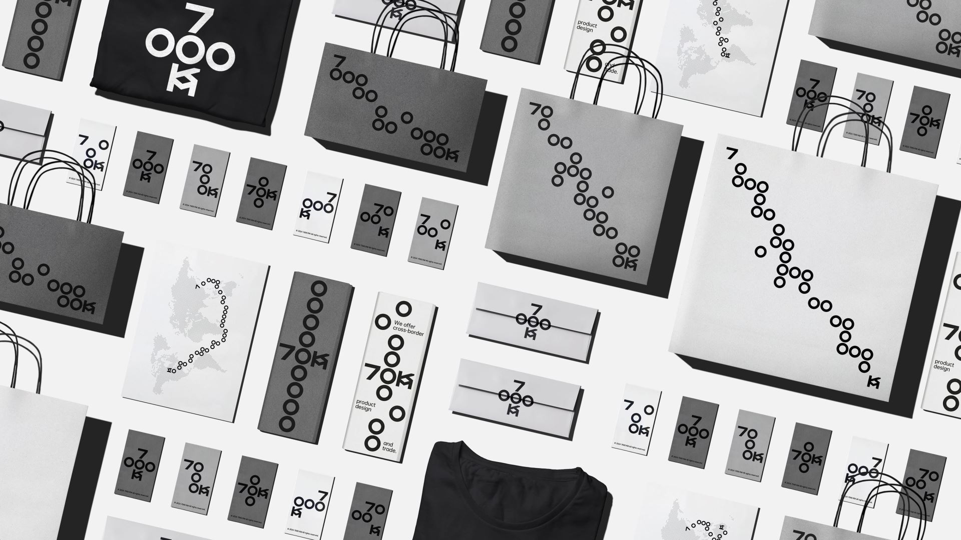
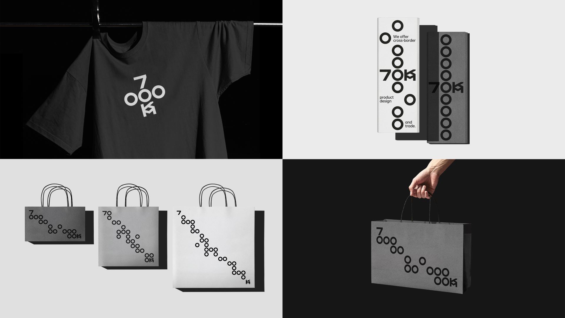
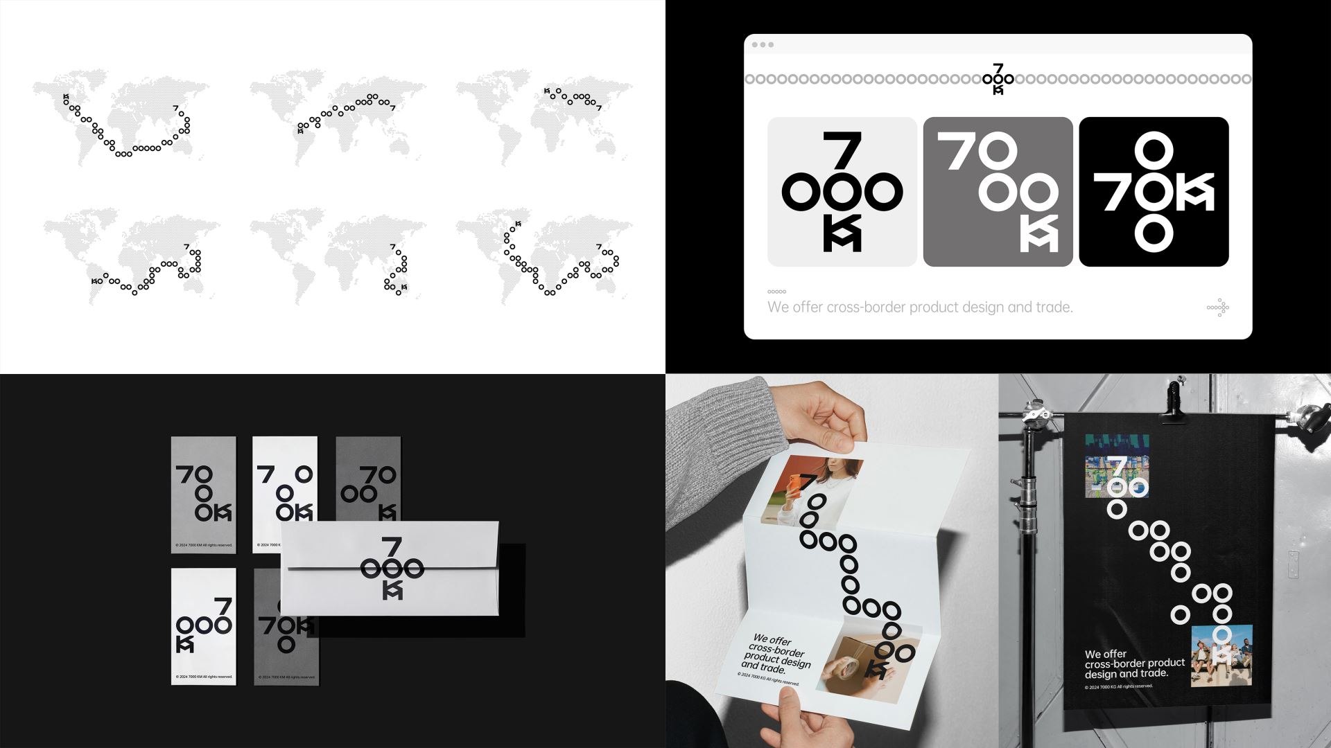
7000KM is a professional international trading company with operations in major economies such as America, Europe and Australia. Its name is derived from the total length of the Silk Road, the world's earliest international trade route, which gives the brand ethos a sense of romance.
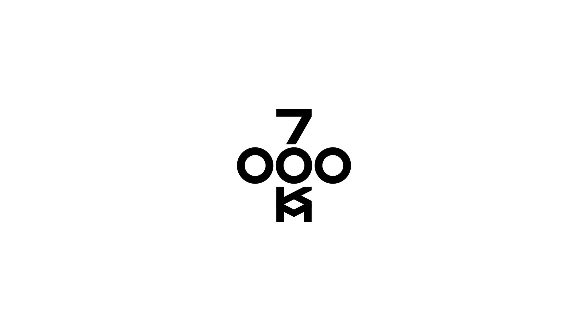
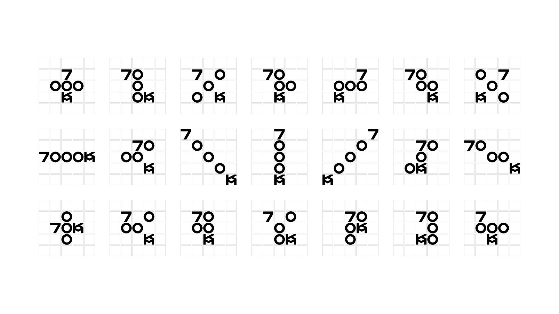
Our understanding of international trade and the Silk Road is that it is free, flexible, and friendly like a network spreading out, so we created a logo and visual identity for 7000KM based on a grid system. 7000KM's letters are condensed into a 5×5 grid, arranged and shuttled under the rules, so that the logo becomes dynamic and interesting, echoing the freedom and flexibility of the trade network. At the same time, the number 0 can also be extended into a "map route" representing trade and the silk road, linking from a starting point (the number 7) to an end point (the letter KM), which strengthens the impression of the brand, enriches the brand's emotional attributes, and helps the brand to develop more quickly.
7000KM是專業的國際貿易公司,業務遍佈美洲、歐洲、澳洲等主要經濟體,其名字來源於世界上最早的國際貿易線路⸺絲綢之路的總長度,這也讓品牌充斥著浪漫氣質。
我們對國際貿易和絲綢之路的理解是自由的、靈活的、如網路蔓延的友好往來,因此我們為7000KM創造了一套基於網格系統的Logo和視覺識別系統。7000KM的字母被濃縮進一個5×5網格中,在規則下排列穿梭,因此Logo變得動態和有趣,呼應了貿易網路的自由靈活。同時數字0也可以延展成代表貿易和絲路的“地圖路線”,從一個起點(數字7)串聯到達一個終點(字母KM),強化了品牌印象,豐富了品牌的情感屬性,説明品牌更快速的發展。


