
 【Prizes|獎項】Distinction|優選
【Country/Region|國家或地區】France|法國
【Group/Designer|設計團隊/設計師】baldinger•vu-huu :Toan Vu-Huu, André Baldinger, Jimmy Le Guennec, Chantal Grossen, Fanny Hamelin
【Description|作品介紹】
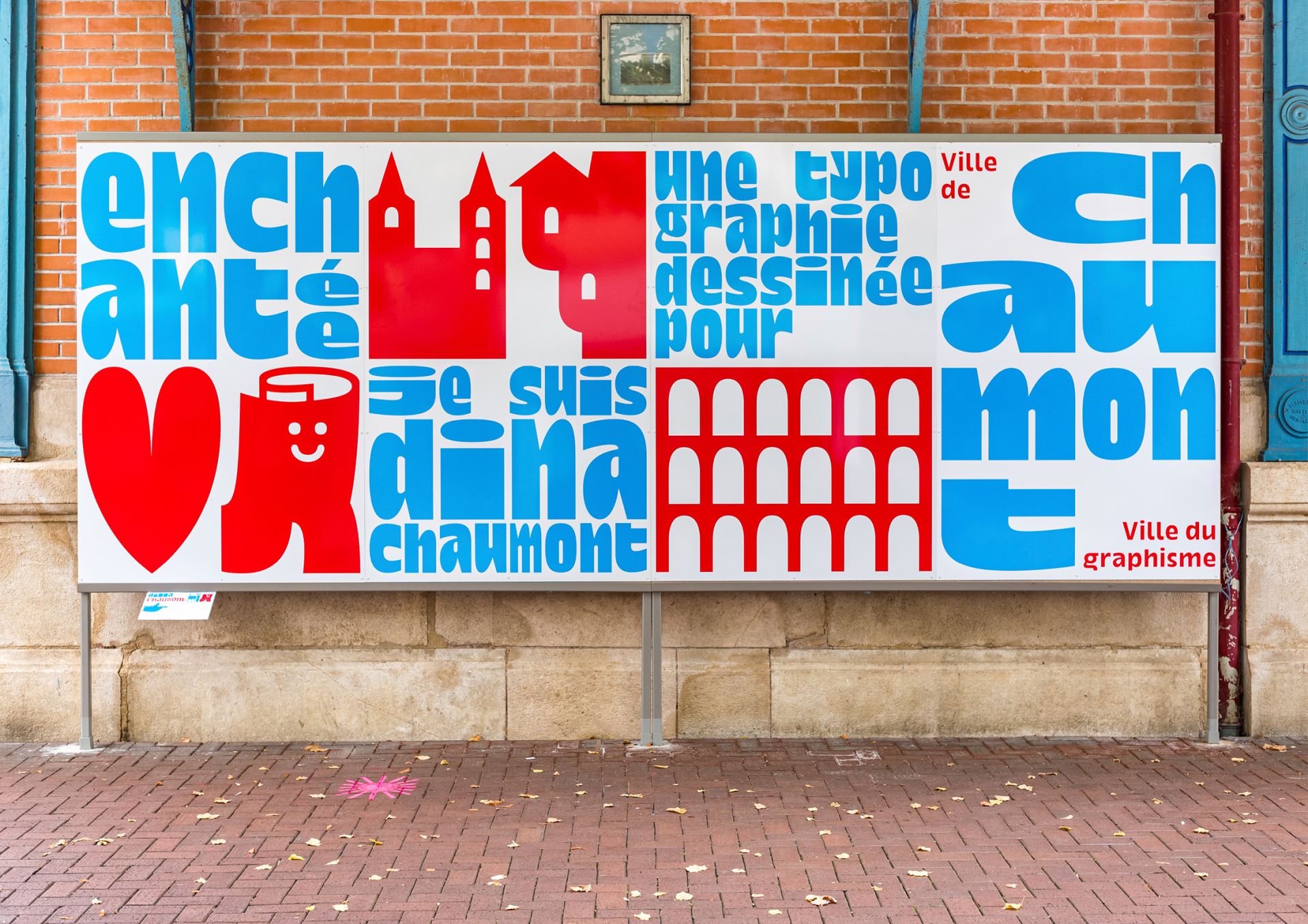
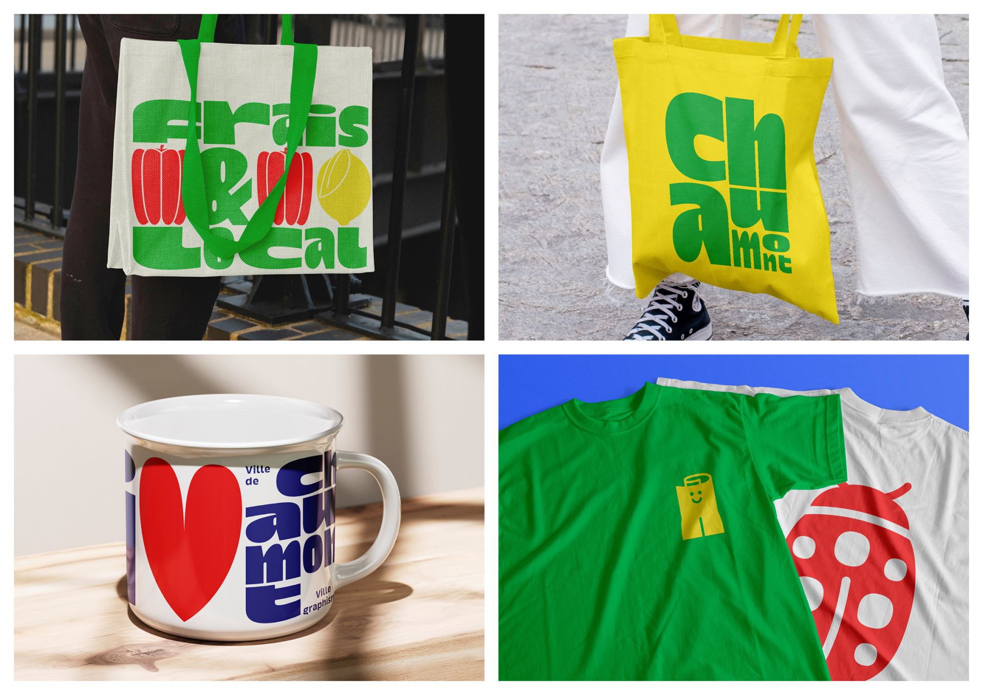
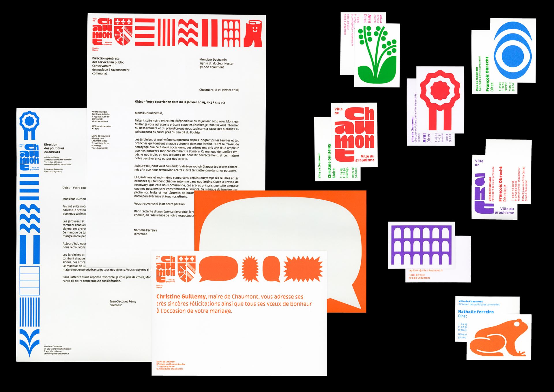
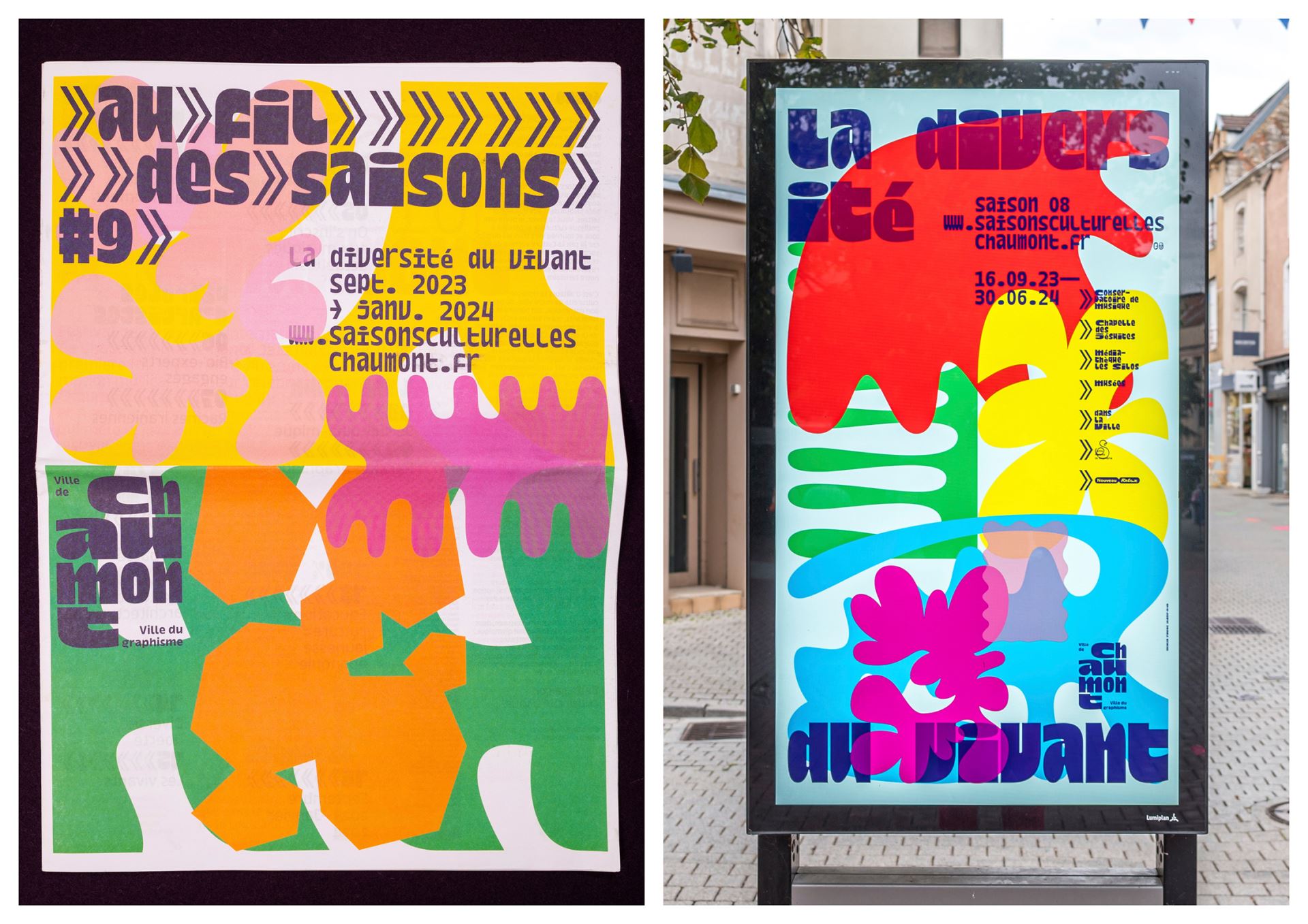
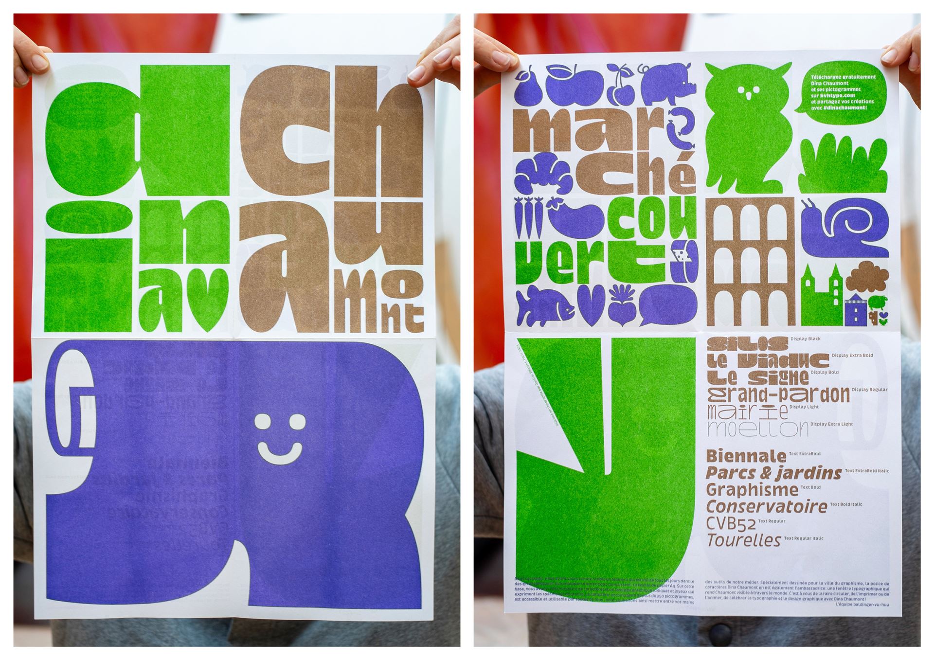
Graphic design is the formal treatment of information in a given format. This project makes a familiar graphic design element accessible to all. DIN (Deutsche Industrie Norm), an international standard from 1922 Germany, inspired the typeface design. DIN A paper formats ensure efficiency by halving or doubling rectangles without altering proportions. Dina Chaumont Display, a monospaced typeface, was born from this concept. Each letter is a «poster-letter» based on DIN A proportions. Inspired by the Dutailly collection, Raymond Savignac’s poster for the first Chaumont Poster Festival, and Roger Excoffon’s typographic legacy, Dina Chaumont Display features two widths: portrait and landscape, A4 and A3. Over 250 pictograms depict Chaumont’s heritage, including monuments, architecture, graphic design, nature, local shops, sports, and transportation. The new visual identity uses the DIN A concept with a modular system for text and image layouts, creating a cohesive visual expression across media. Vibrant, joyful colors enhance visibility. Accessible for all, baldinger•vu-huu studio shares its tools through these user-friendly letters and pictograms.


