
【Prizes|獎項】Distinction|優選
【Country/Region|國家或地區】China|中國大陸
【Group/Designer|設計團隊/設計師】ONNFF|極中輸出 : ZHENGRUI HU |胡正銳
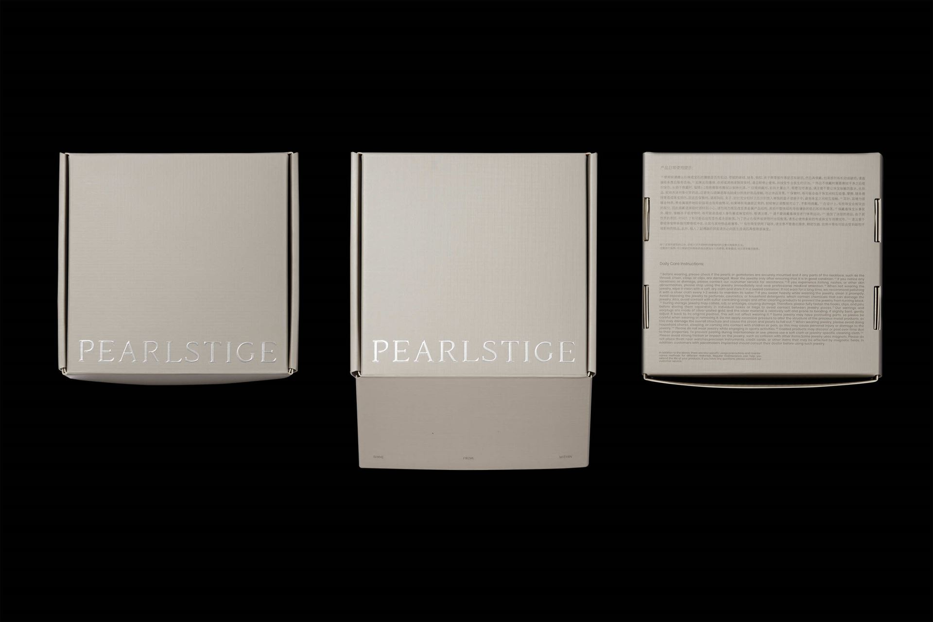
【Description|作品介紹】
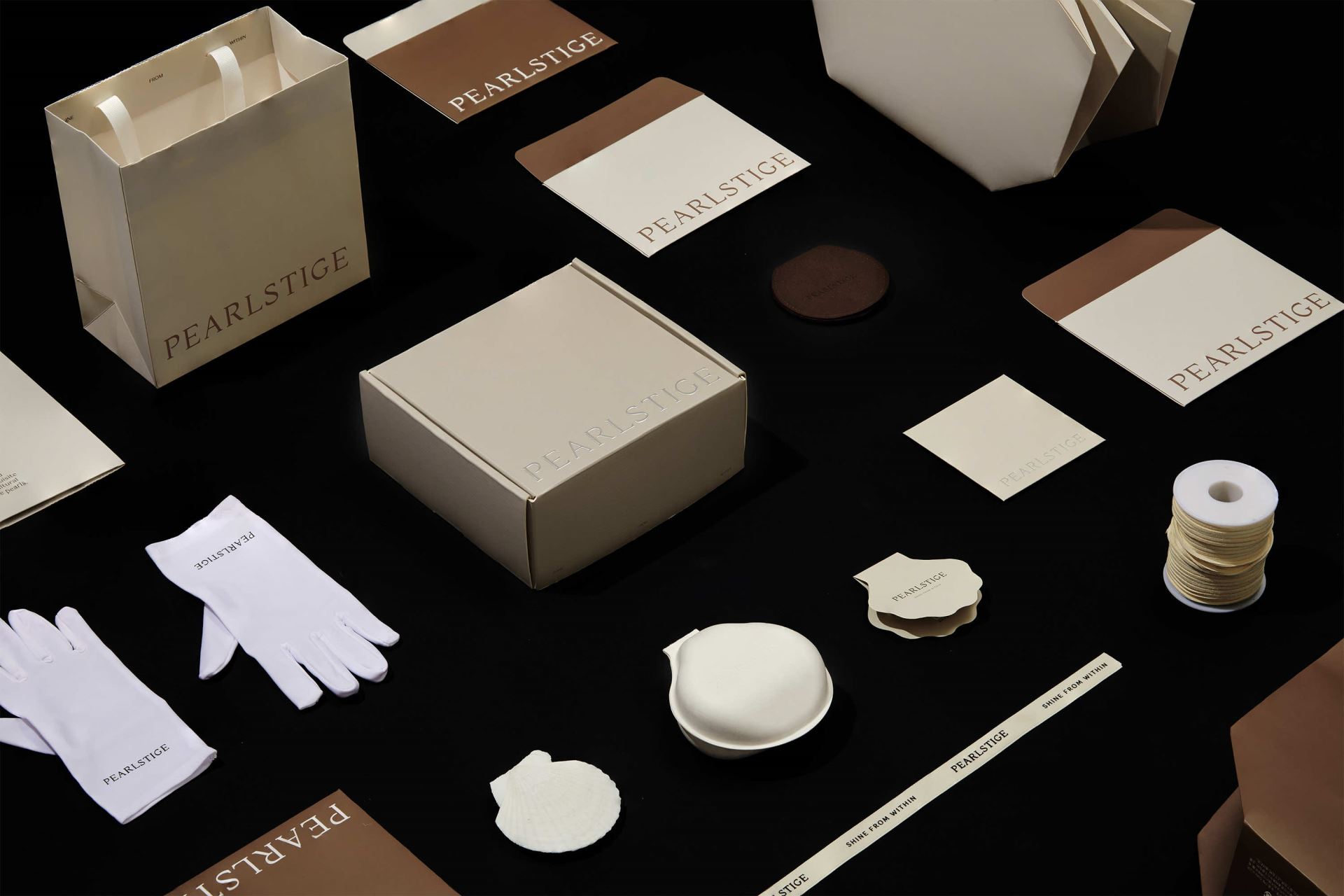
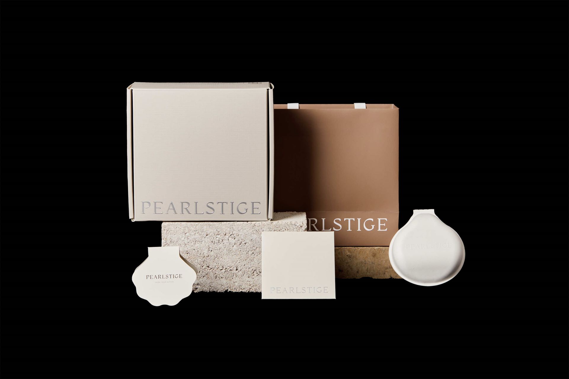
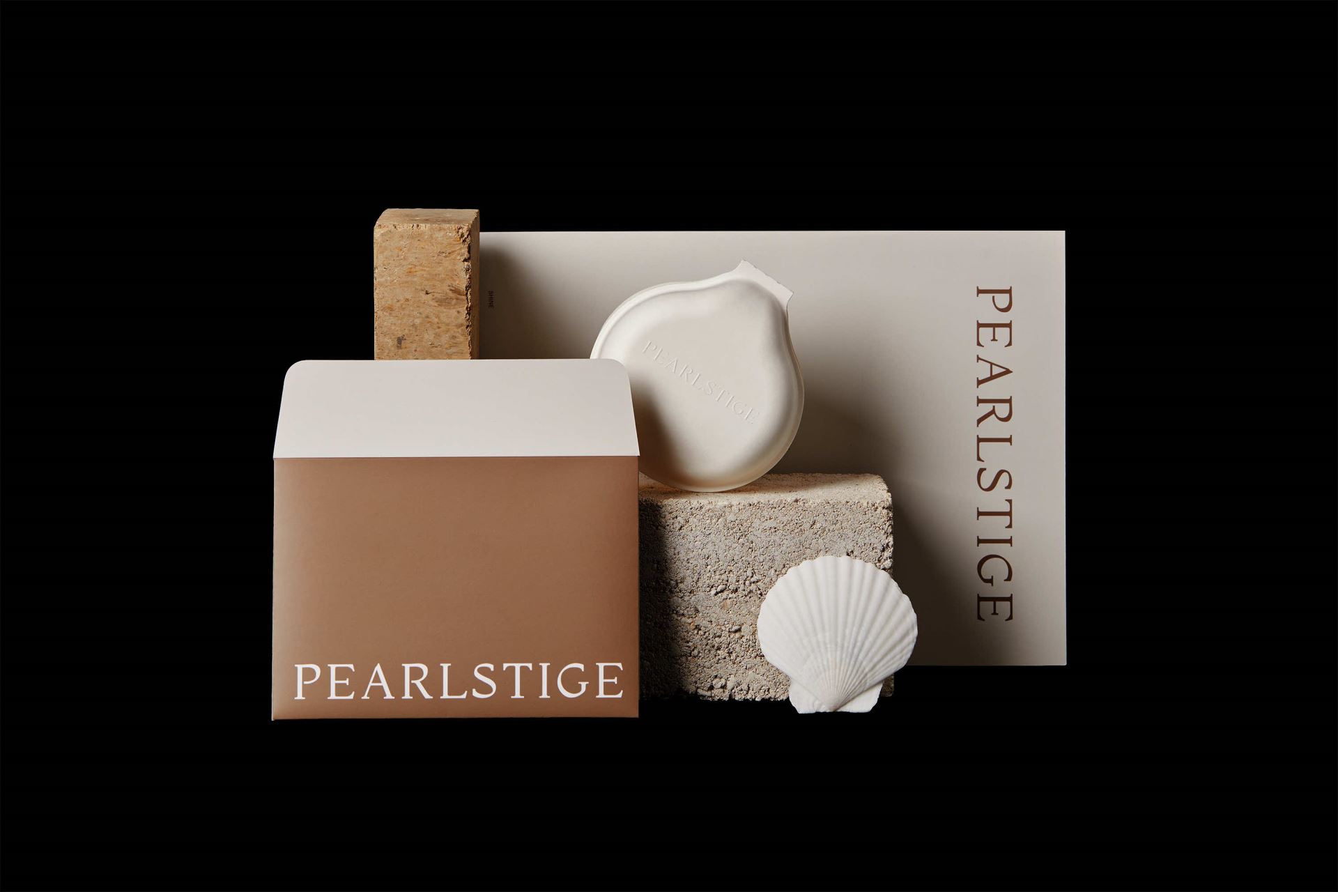
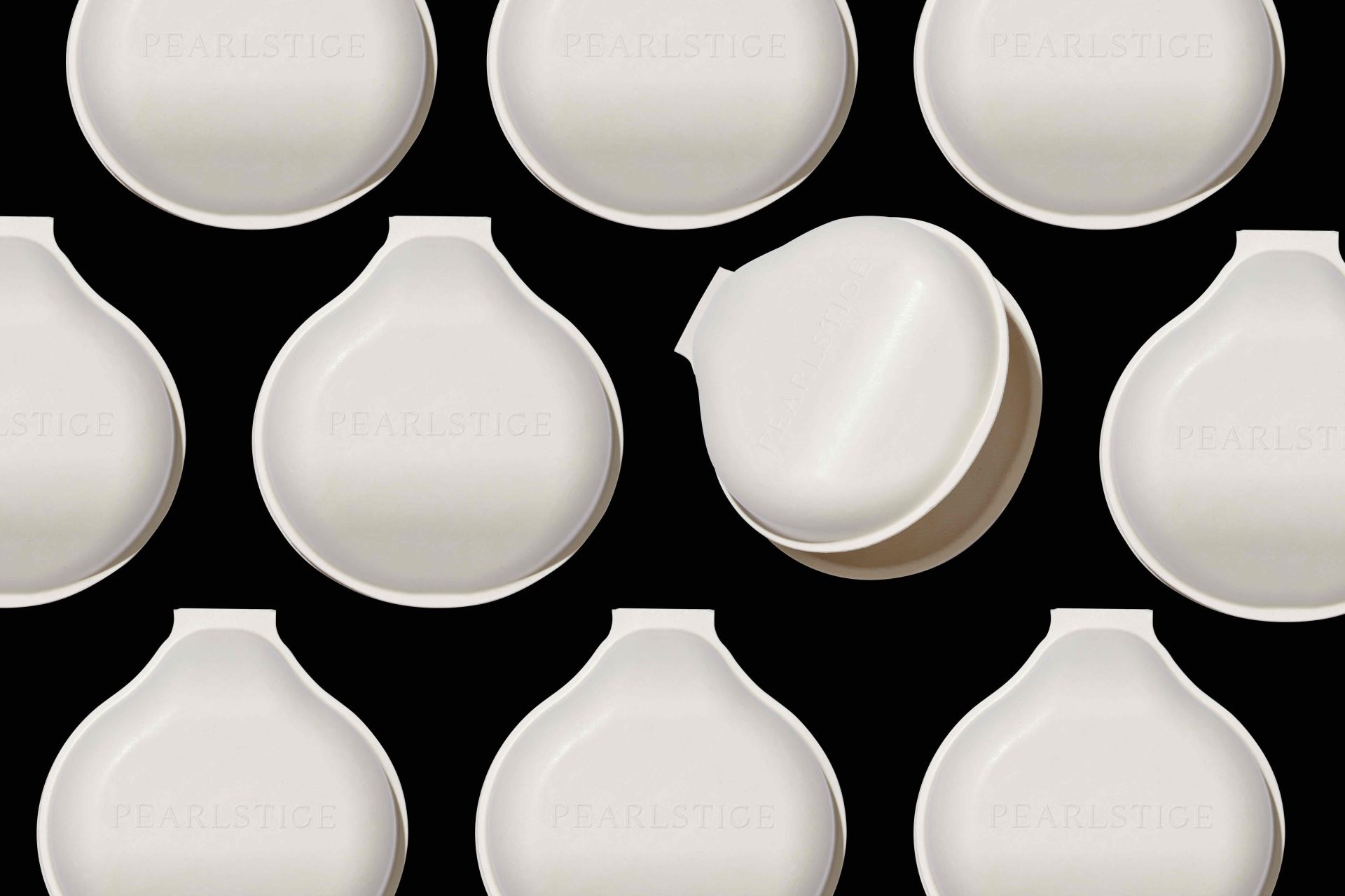
The PEARLSTIGE brand design process is a journey full of unknowns. We tried to explore the possibilities of pearl packaging and to develop a packaging language that is unique to PEARLSTIGE. For the creation of the brand identity, we used the most intuitive classic serif font as the expression of the logo. The neutral gray colour close to gypsum and the brownish red colour of the freshwater pearl shell surface are used as embellishment, highlighting the natural and real attitude that the brand wants to convey. PEARLSTIGE proudly holds the distinction of being China's first B Corp in the jewelry industry. They are committed to promoting sustainable development in both society and the environment. The packaging material is made from sugarcane residue, which gracefully returns to nature in a mere 90 days, free of any synthetic or harmful substances. Their philosophy is simple but profound: to take from nature, to give back to nature, to promote a regenerative cycle of life.
PEARLSTIGE的品牌設計過程,是一段充滿未知的旅程。我們嘗試去探索 珍珠包裝的各種可能性,並且挖掘一套專屬PEARLSTIGE的包裝語言。在 品牌識別的建立上,我們用最直觀的古典襯線字體文字來作為LOGO的表 達。運用接近石膏的中性灰色和淡水珍珠⻉殼表面的棕紅色作為點綴,凸顯 出品牌想要傳遞的低調,自然,真實的狀態。 PEARLSTIGE 是中國珠寶業第一家通過B Corp認證的共益企業,他們一直積極推動社會和環境的可持續發展,為此,我們使用90天可完全自然降解的甘蔗渣材質作為主要包材,無塑無膠,無有害物質。取於自然,還 於自然,循環利用。珍珠品牌的設計,應該留給顧客更多的空白去想。 PEARLSTIGE的整體品牌設計,我們克制了設計感,把設計的部分賦能到 真正起到環保和實用的地方,用更直觀的材質,工藝,排版,潛移默化得 幫助客戶理解到品牌的內涵。


