

【Prizes|獎項】Distinction|優選
【Country/Region|國家或地區】Taiwan|台灣
【Group/Designer|設計團隊/設計師】Bito|甲蟲創意有限公司 : Keng-Ming Liu|劉耕名, Tifu Huang|黃鈺凱, Han-Shu Wu|吳函書, Joe Yang|楊芸喬, Johnny Yang|楊鎬維
【Description|作品介紹】
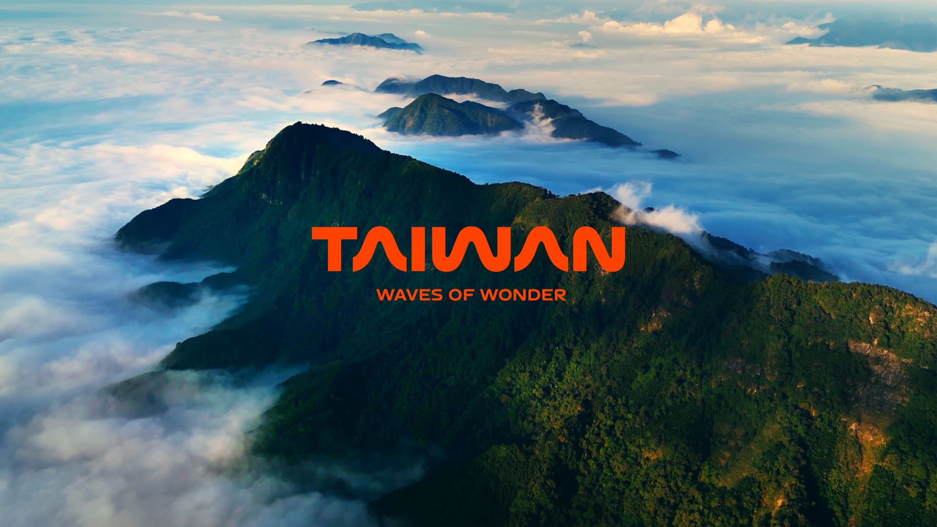
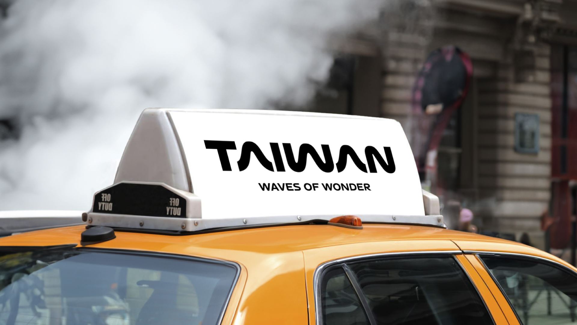
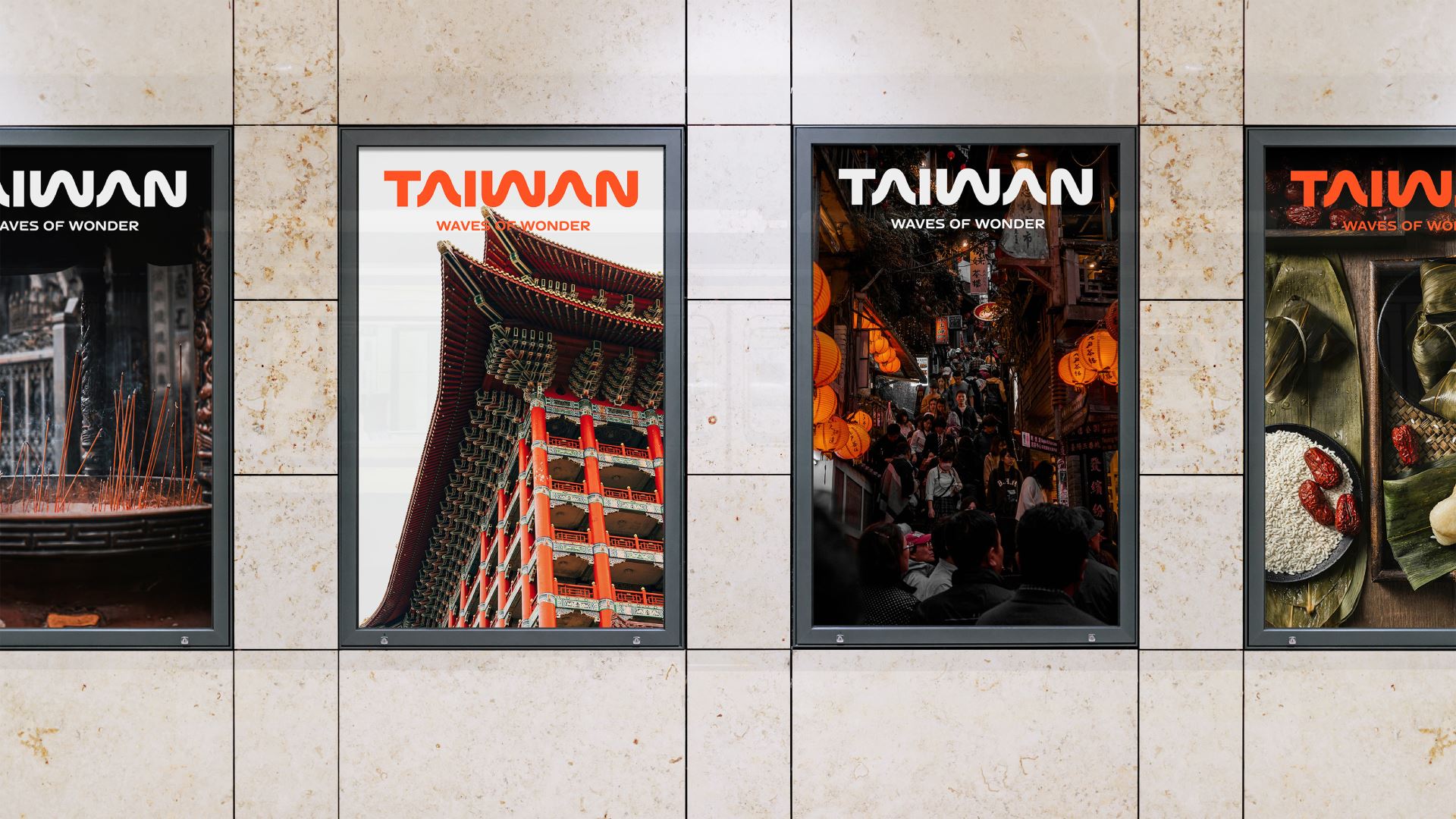
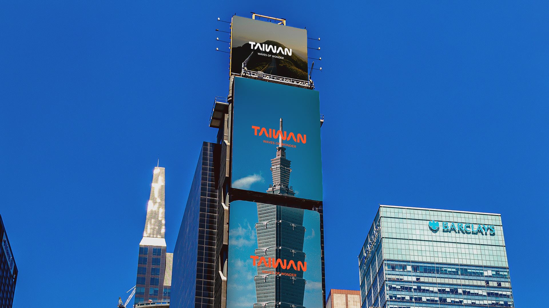
Taiwan carries a wealth of diverse natural resources despite its small size. Tourists can experience its beautiful mountains, stunning oceans, highways, and railways all in one day. Bito captures the essence of Taiwan’s dynamic landscapes and translates these powerful lines into modern visual languages. Taiwan Tourism aims to offer diverse travel experiences, showcasing this beautiful island from a unique perspective. Our design team reimagines Taiwan Tourism with the concept of "WAVES OF WONDER," promising an unforgettable journey full of surprises. The new logo draws inspiration from Taiwan's undulating mountains, seas, and roads. These flowing waves symbolize not only Taiwan’s marvelous scenery, but also reflect excitement for all exploring the country. Compared to the mixed-case logotype in version 2.0, the all-caps letters in version 3.0 convey a confident and powerful characteristic, ensuring it remains timeless over the coming years. “ This is a minimalist identity, but establishing a brand worldview is anything but simple. We use the beautiful curves of Taiwan to symbolize hope, offering the best gift to this land. “ — Keng Ming Liu, Founder & Creative Director of Bito


