
 【獎項 Prizes】 優選 Distinction
【國家或地區 Country/Region】 Russia 俄國
【公司/團隊 Company/Group】 ESH gruppa
【設計師姓名 Designer】 Stefan Lashko, Nadezhda Kosenkova, Violetta Postnova, Alyona Melnikova,
【作品介紹 Description】
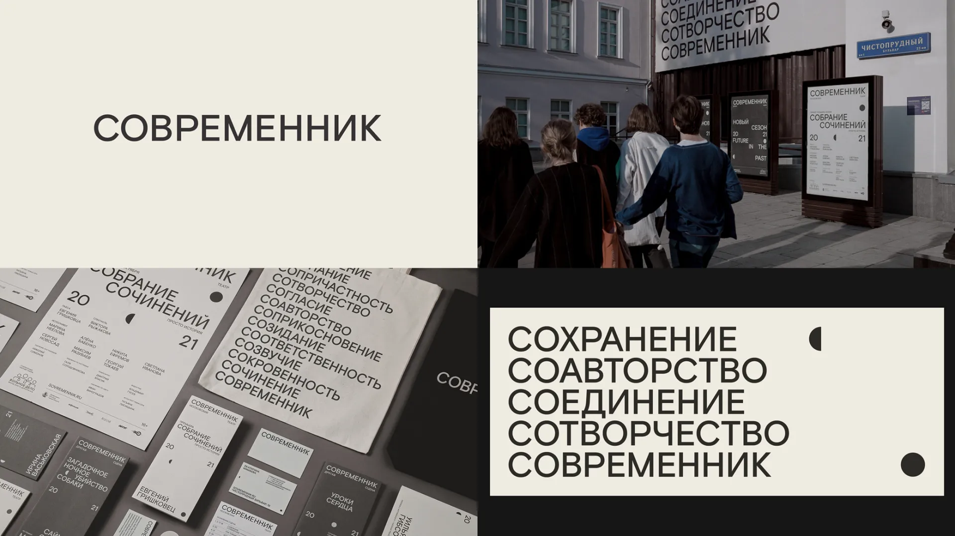
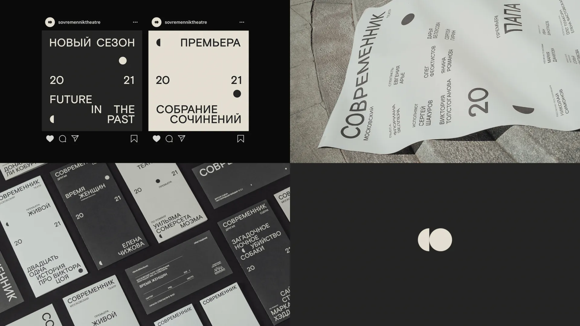
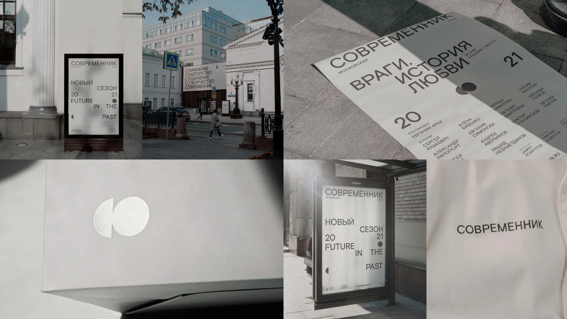
在為Sovremennik劇院設計新的識別形象之過程中,我們查閱了許多該劇院的檔案資料,以及六零年代和七零年代的舊海報。那時所有的海報皆以排印作為基準樣式,僅含打字部分而並未附上圖像。我們認為在新的標識中採用相同的方法是一個不錯的主意,不過應將多餘的裝飾和風格化字體從中抽出。 我們嘗試使用了「современник」這個名字(「современник」在俄語中指的是當代的意思),並發現了大量與「СО」字首相同的詞,且與劇院的新概念及其核心價值相符。我們也使用了這個「СО」字首來製作商標,但它並非是那種的常見的位於海報底角的標誌,而是在所有佈局中皆能產生不同的表現效果。我們還在所有版面設計中放置了當前季節的年份(現在是20-21),同時顯示了過去和未來,而「современник」就正好位於兩者之間。
While working on the new identity for Sovremennik Theatre we went through a lot of theatre’s archive materials, old posters from 60s and 70s. Back then all posters were based on typography, just type with no images. We though that it would be nice to take the same approach into the new identity, but without decorations and stylised fonts. We have experimented with the name “современник” (“современник” means contemporary in Russian) and found a lot of words with the same prefix “СО” that matched the new concept of the theatre and it’s core values. We have also used this “СО” prefix to make a logo, but it’s not your usual logo in the bottom corner of a poster, it’s stands differently across all layouts. We also put years of the current season in all the layouts (now it’s 20—21), showing both past and future, “современник” stands right in-between.


